Chambers
- Galle Fortsince 2015
- Park Street MewsColombo
Chambers is a Middle Eastern restaurant in Sri Lanka, in a Galle Fort building that used to be a lawyer’s chambers, with a second branch on Park Street Mews in Colombo. In 2022 I redrew its identity around its signature dish, the tagine.
The old logo was a line drawing of a steaming tagine with a brush-script name. The new mark keeps the tagine and builds it from a Moroccan lattice, taken from the patterns painted on real ones, with diamond points borrowed from Arabic calligraphy. It is cut to work in a single colour, so the same artwork goes on a sign, a bag or a rubber stamp.
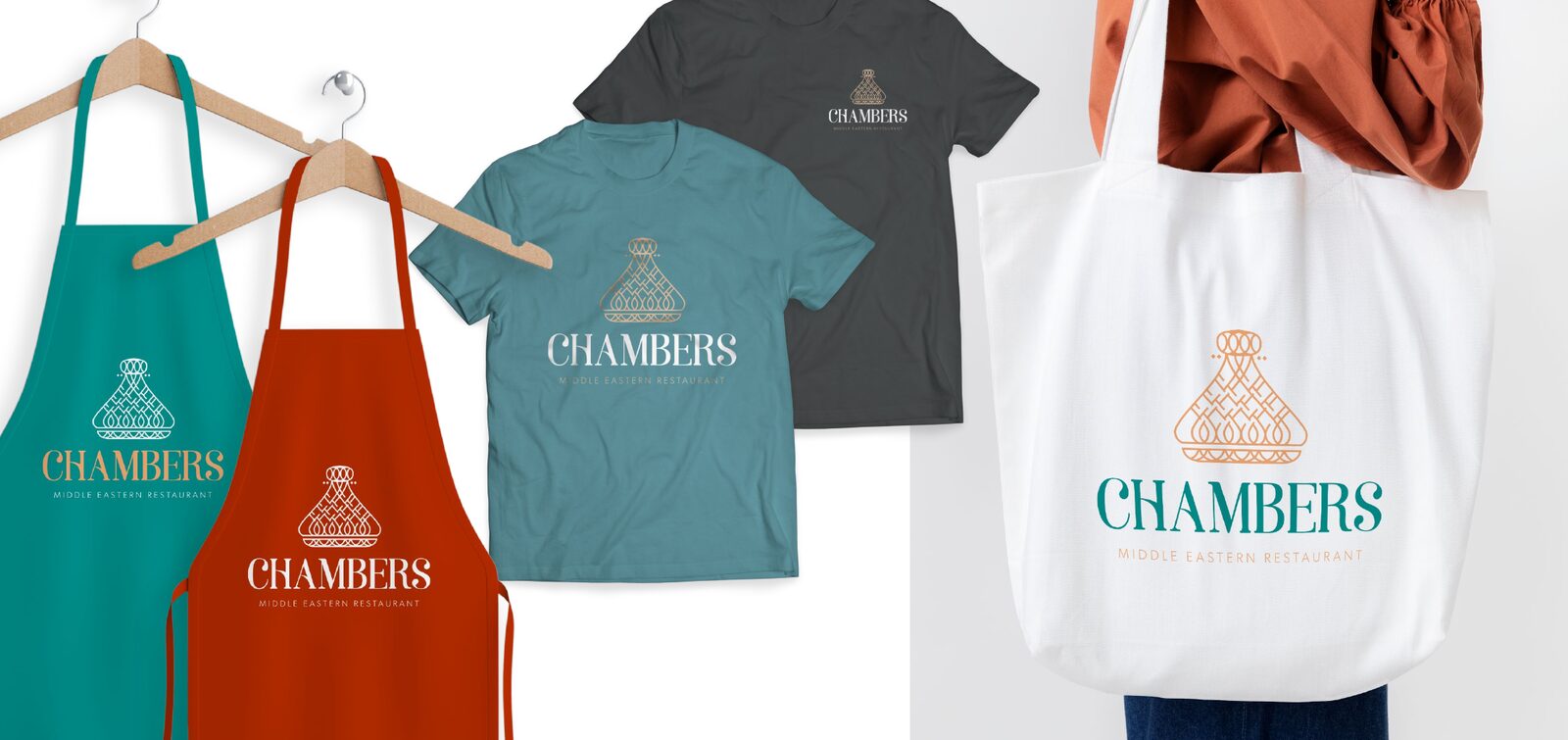
The palette comes from the painted tagines and plates on the restaurant’s tables. Today the identity is on Chambers’ signs, its carrier bags and its Instagram.
Before and after
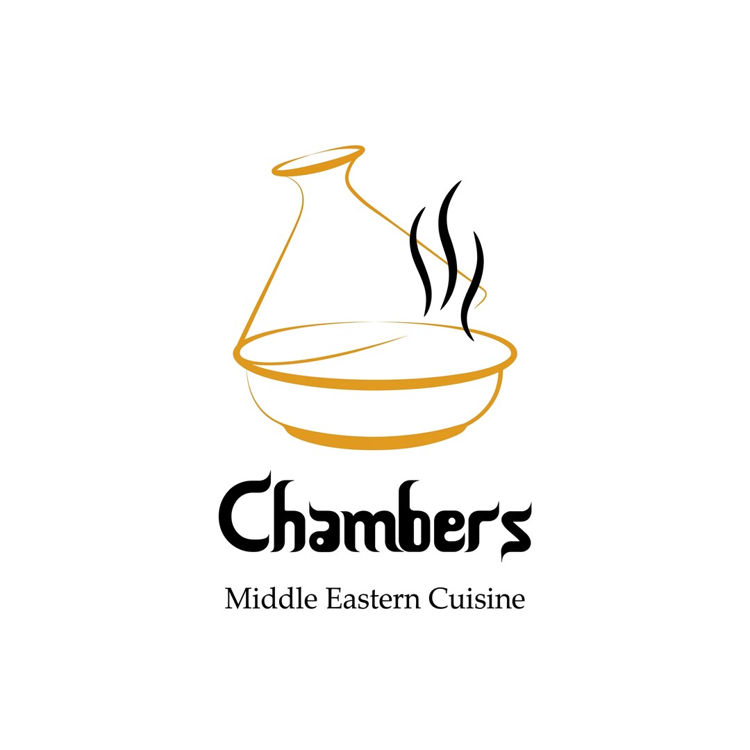
Before A hand-drawn tagine with rising steam, and a brush-script name.
After The same dish, woven from a Moroccan lattice, with a serif wordmark.
The mark
Every part of it points back to the food and the region.
- 1A tagine, Chambers’ signature dish, gives the mark its outline.
- 2The lattice comes from the patterns painted on real tagines.
- 3Diamond points borrow the accents of Arabic calligraphy.
- 4A serif with arched stems in the H and A, which lean towards Arabic lettering.
- 5A quiet sans for the descriptor, so it never competes with the mark.
How it was drawn
From a few circles to a knot in a single colour, in five steps.
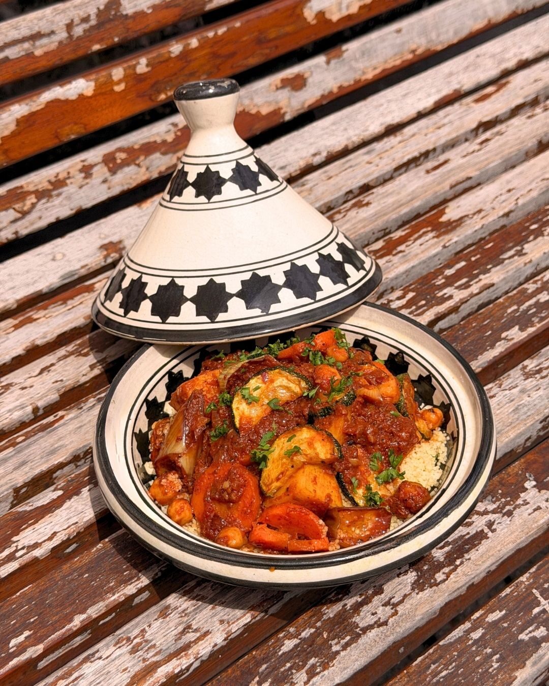
It starts on the table. The painted tagines Chambers serves in gave the mark its shape and its pattern.
Colour
Taken from the bold, painted tagines and plates used at Chambers.
Harissa
- Hex
- #B62B00
- RGB
- 182, 43, 0
- CMYK
- 0, 76, 100, 29
- Pantone
- 1525 C
Saffron
- Hex
- #F7AC74
- RGB
- 247, 172, 116
- CMYK
- 0, 30, 53, 3
- Pantone
- 7410 C
Mint Tea
- Hex
- #82B7AD
- RGB
- 130, 183, 173
- CMYK
- 29, 0, 6, 28
- Pantone
- 5493 C
Turquoise
- Hex
- #00938E
- RGB
- 0, 147, 142
- CMYK
- 100, 0, 3, 42
- Pantone
- 7716 C
Olive
- Hex
- #005A49
- RGB
- 0, 90, 73
- CMYK
- 100, 0, 19, 65
Black and white carry the mark everywhere else.
Type
A serif with character for the name, and a plain sans to stay out of its way.
Soria
ABCDEFGHIJKLM
NOPQRSTUVWXYZ
abcdefghijklm
nopqrstuvwxyz
The stems of the H and A arch like a brush stroke, which adds movement and leans towards Arabic lettering. Contemporary, with a hint of Middle Eastern history.
The descriptor is a light sans, widely spaced, under the name.
Using it
The colour pairings the mark is made for. Tap one to see it.
Saffron on Olive
- StackedSigns, covers, anywhere with room.
- HorizontalWhere height is short.
- IconStamps, and crops on packaging.
- Icon in a circleProfile pictures.
- One colour at a time. The overlaps are cut, so the mark never needs a second colour to read.
- Pick a pairing above. Light marks on the deep colours, deep marks on the light ones.
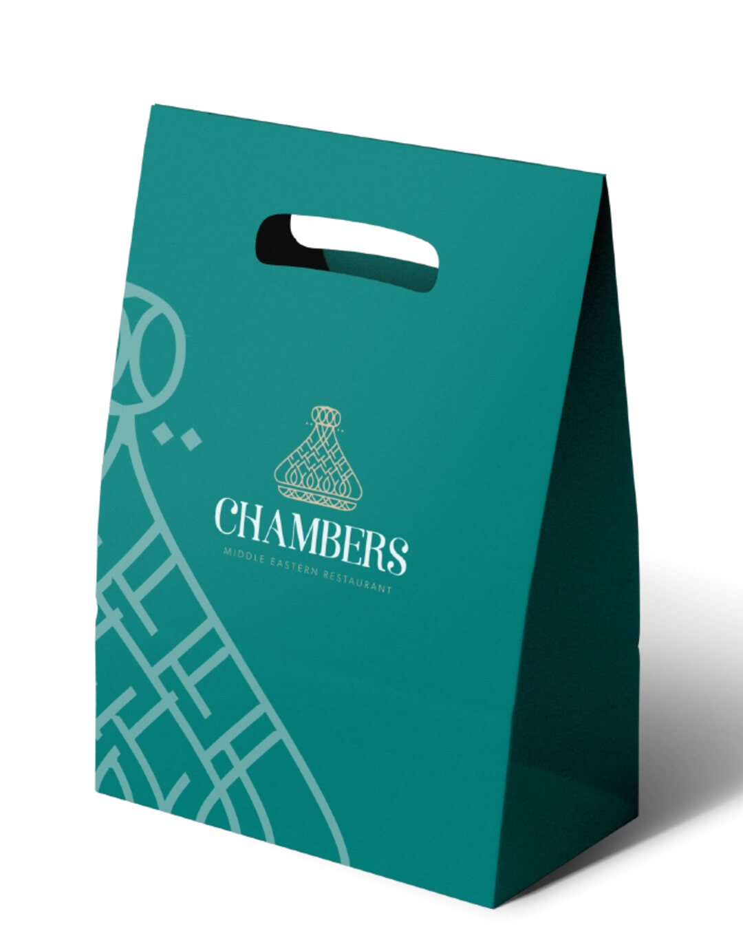
- Let the icon travel alone. It can be cropped large as a pattern, the way it wraps the bags.
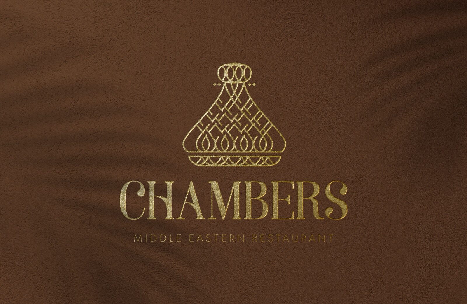
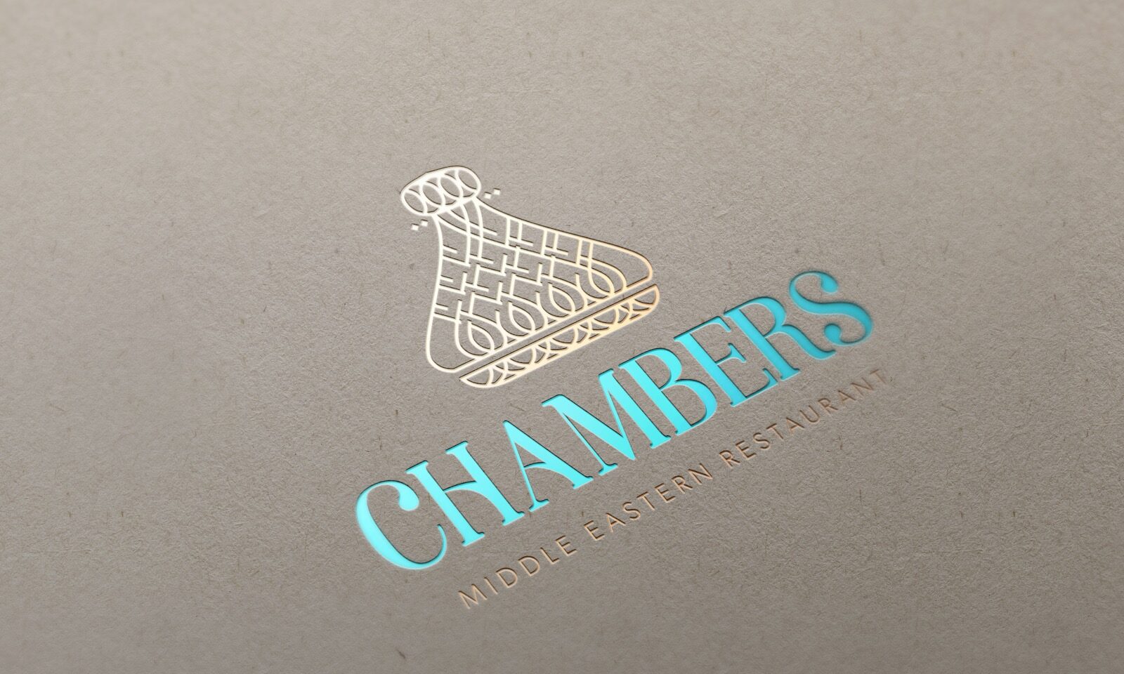
Proposed
How the identity was shown to the client in December 2022.
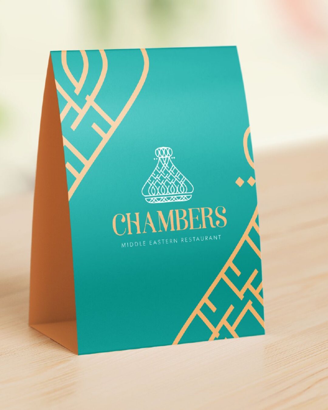
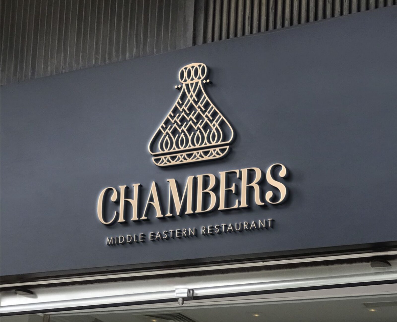
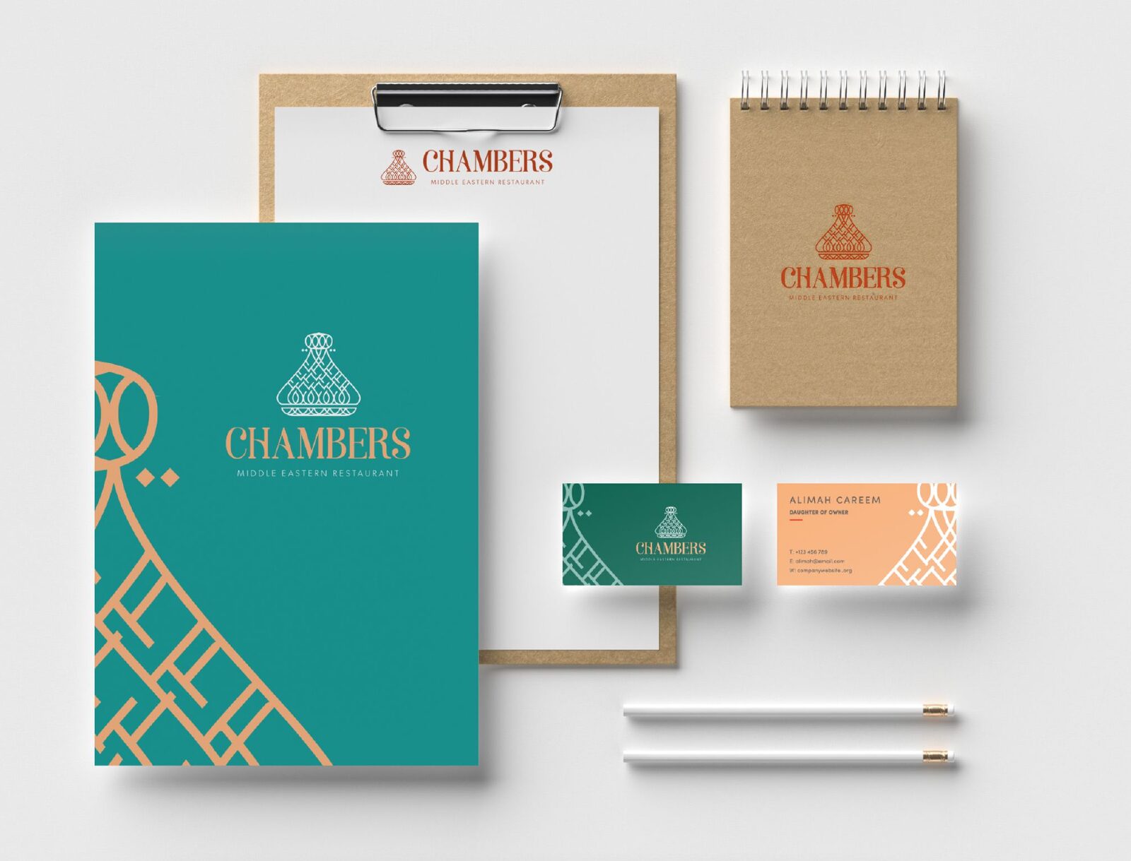
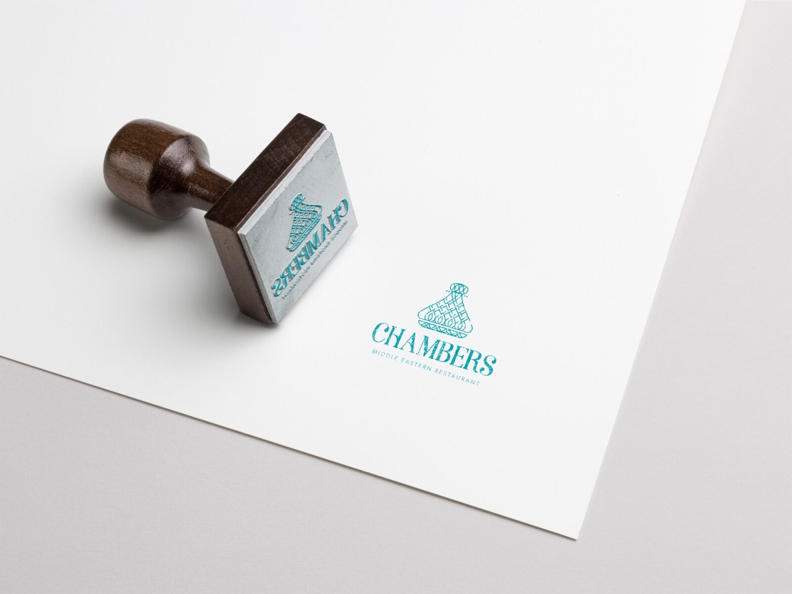
On Instagram
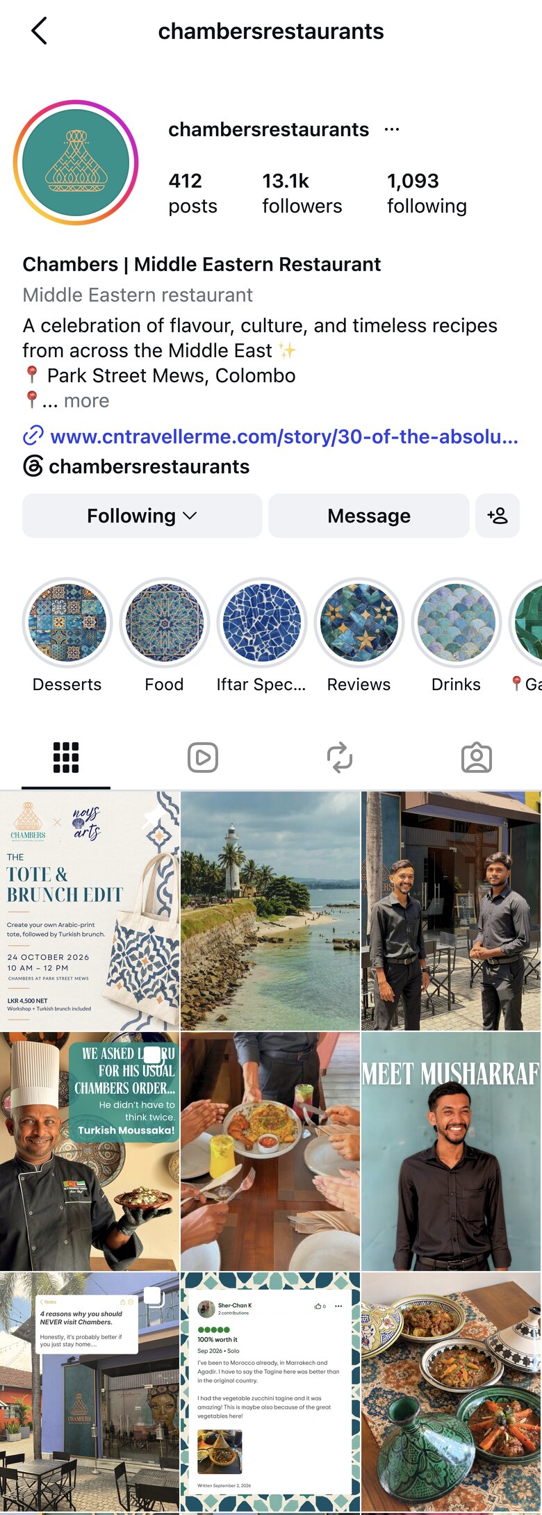
The icon was made to sit in a circle, and that is how Chambers uses it.
Shrunk to a profile picture, the icon still reads as a tagine.
In use
Chambers today: signs, packaging and the table.
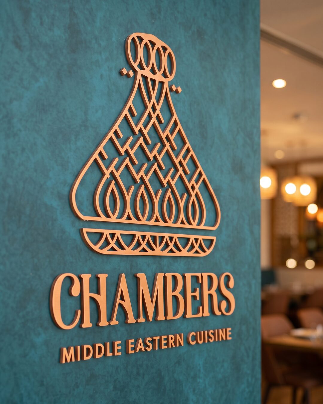
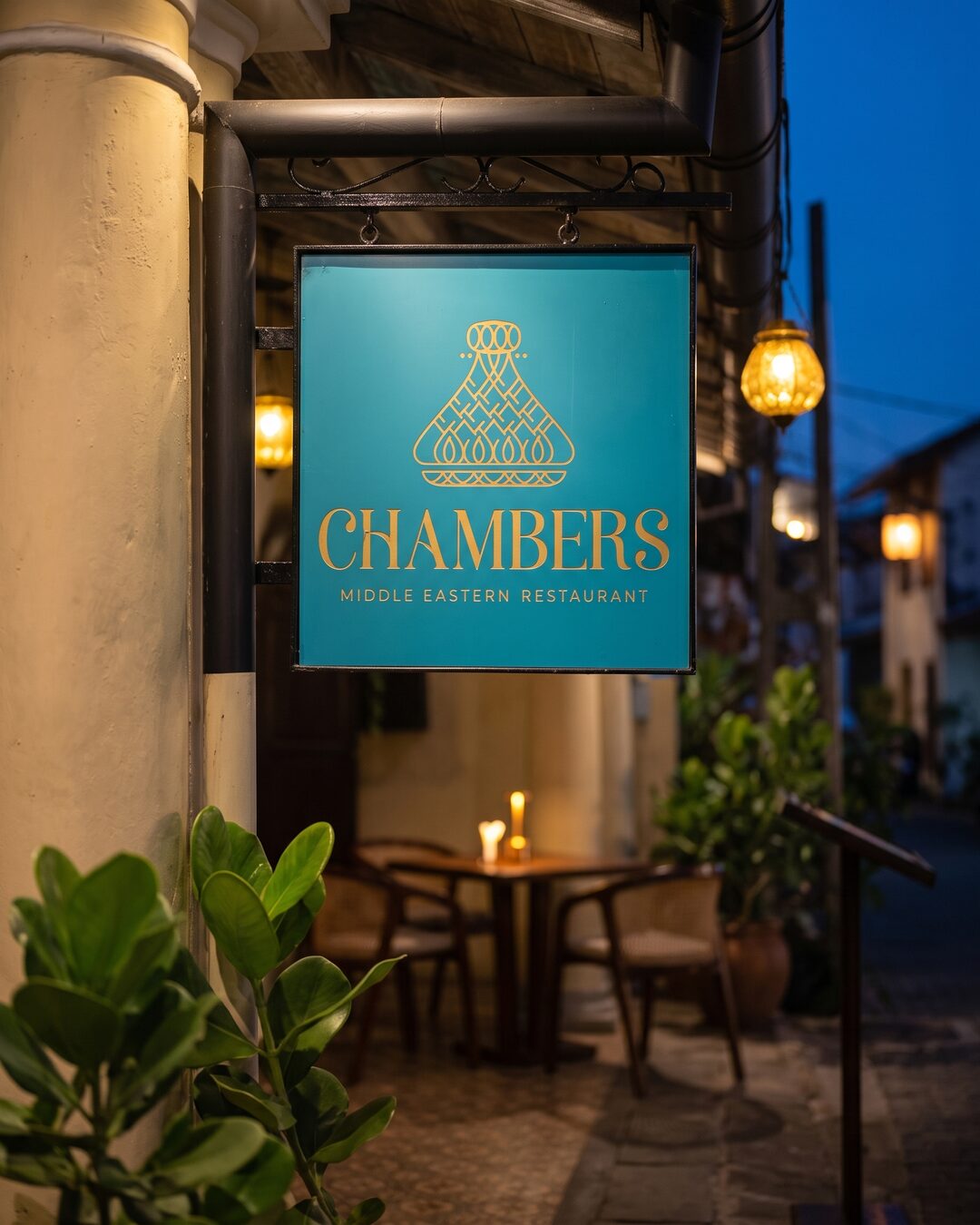
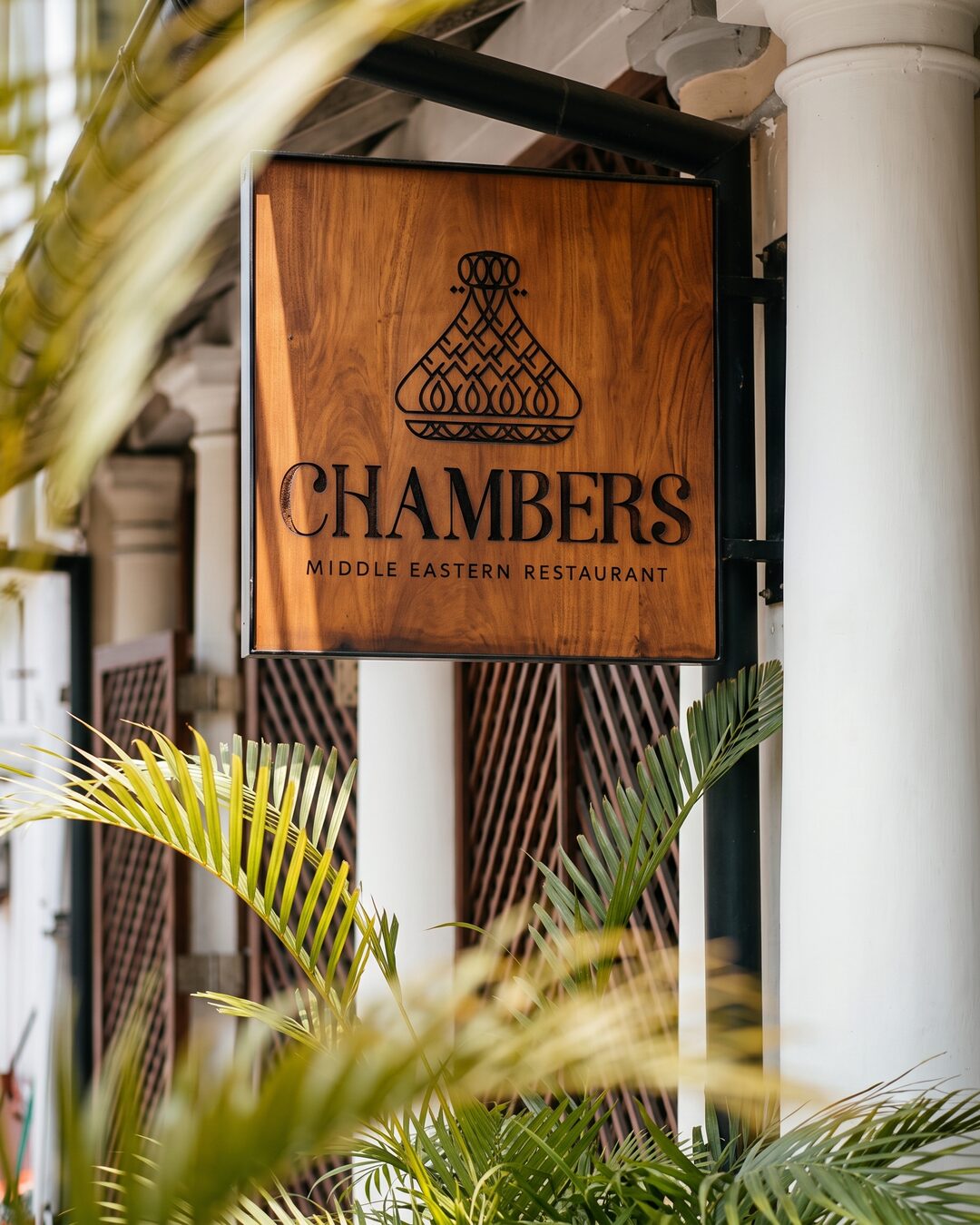
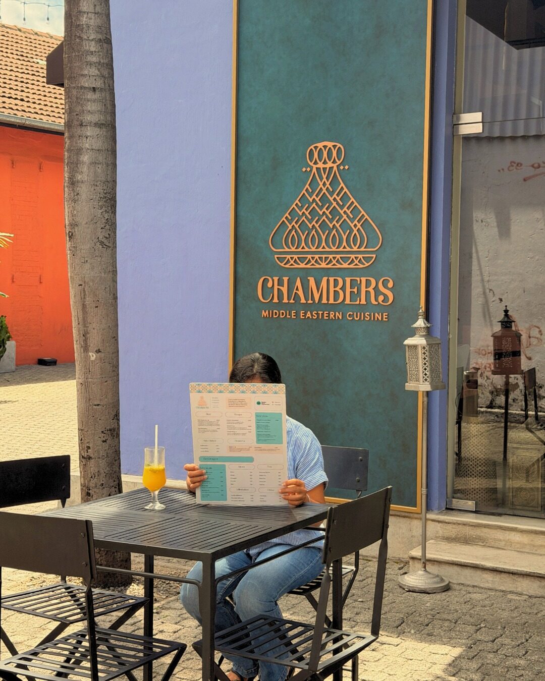

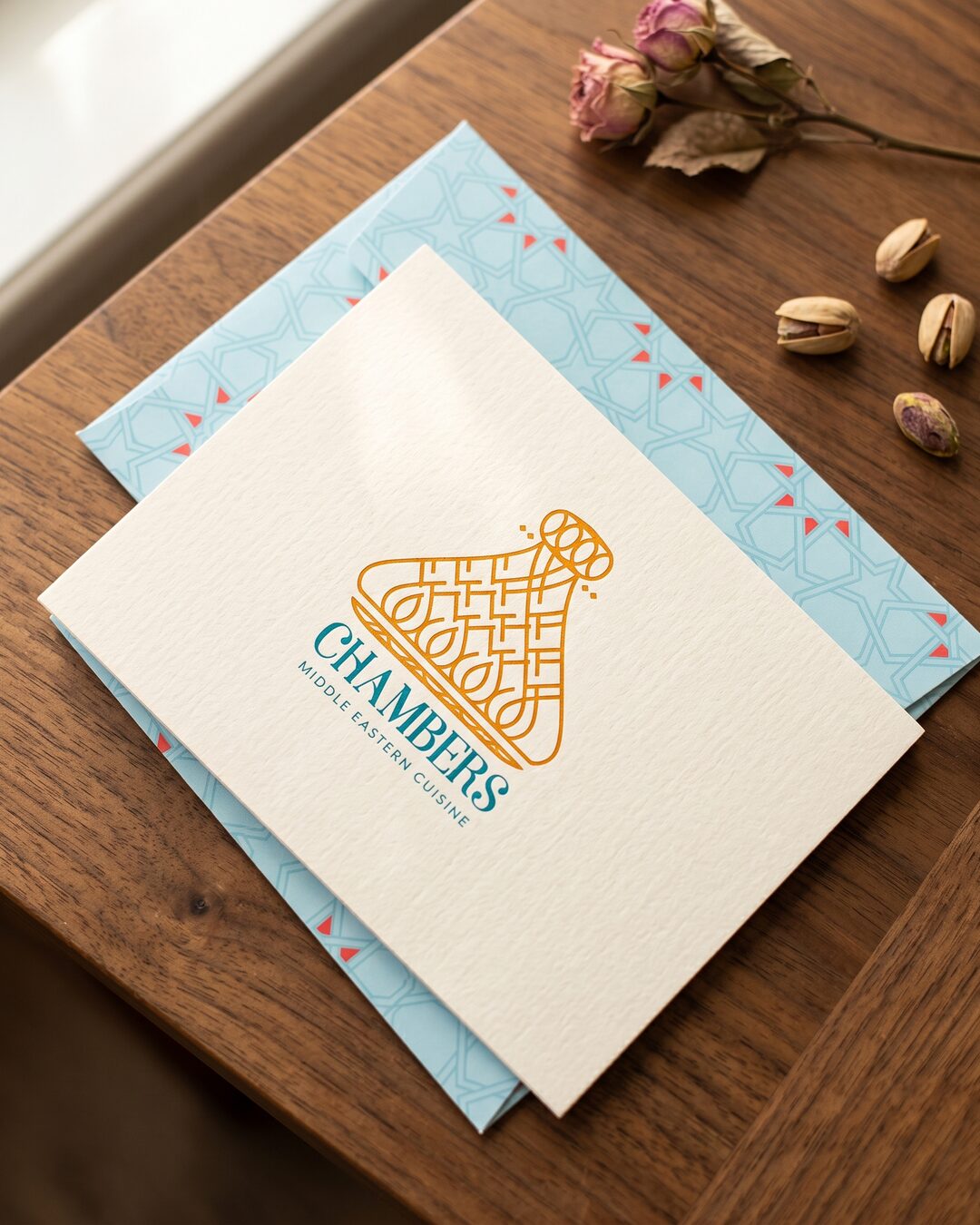
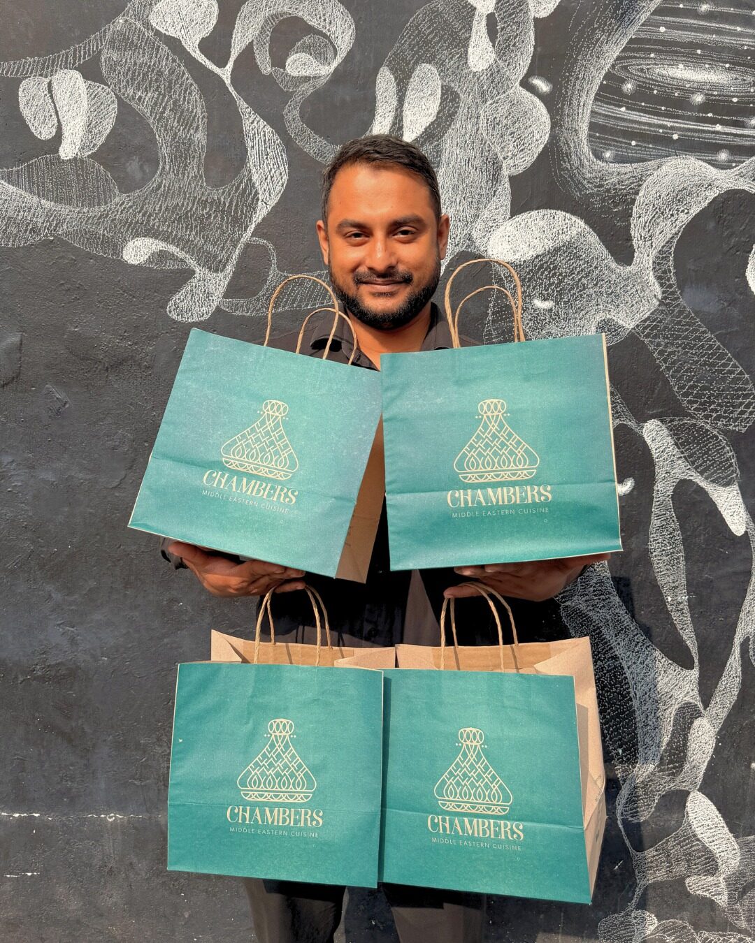
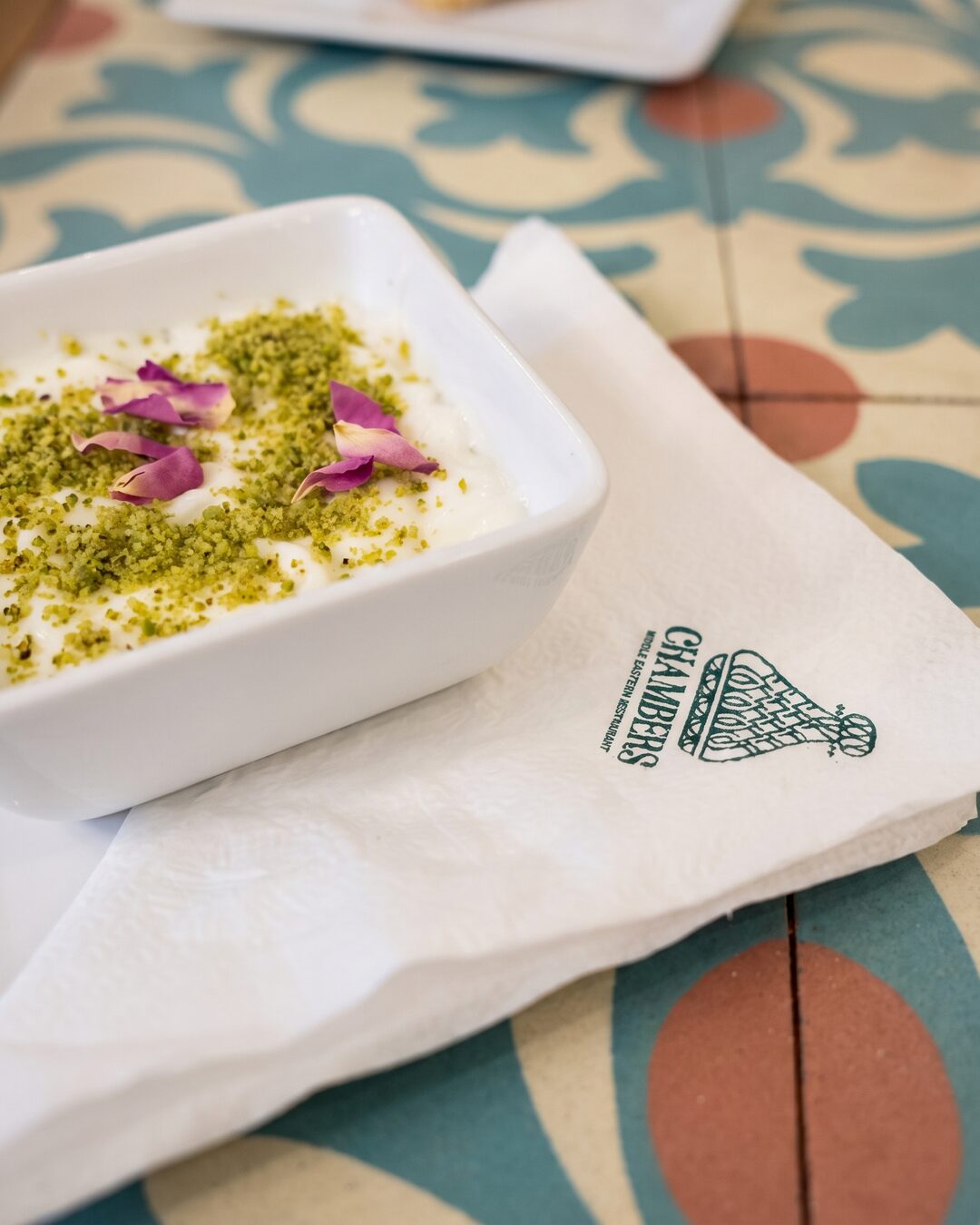
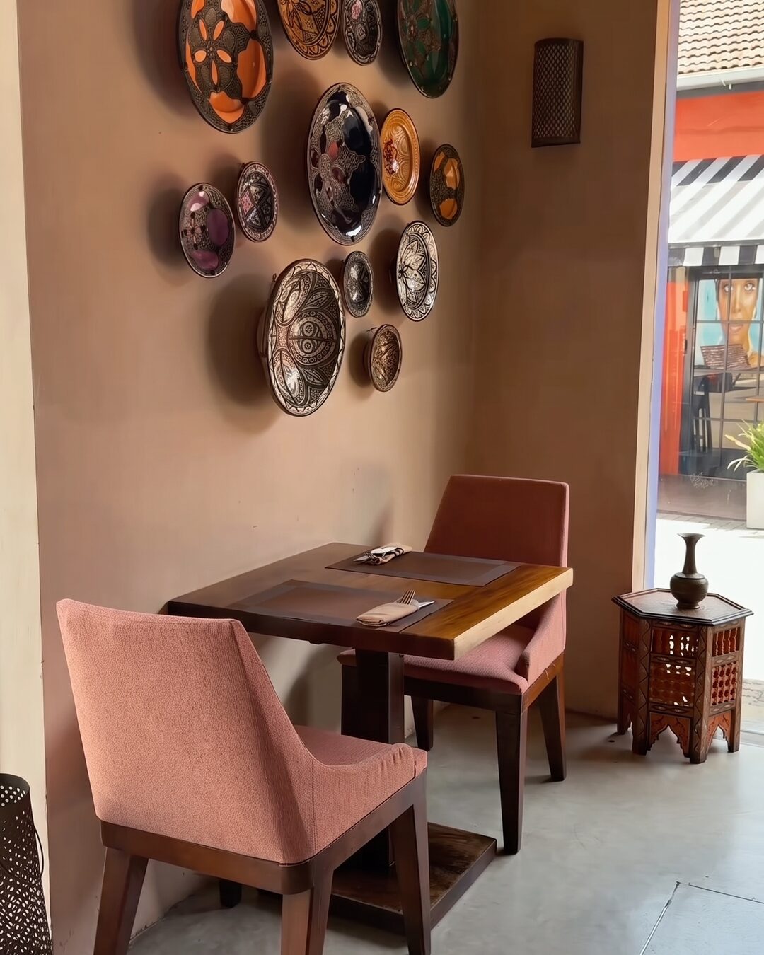
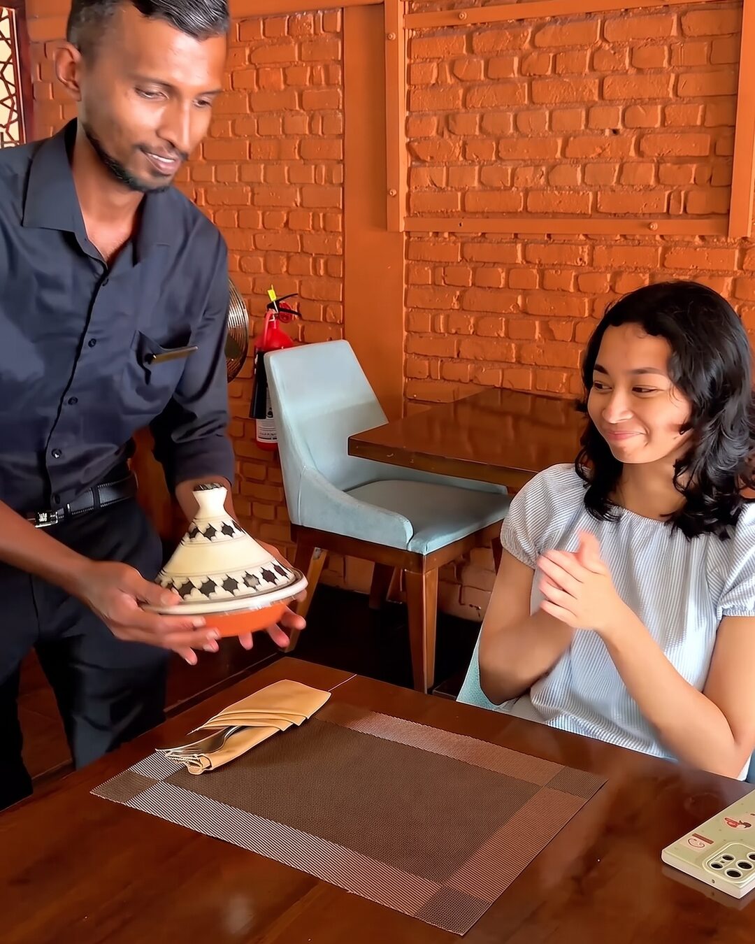
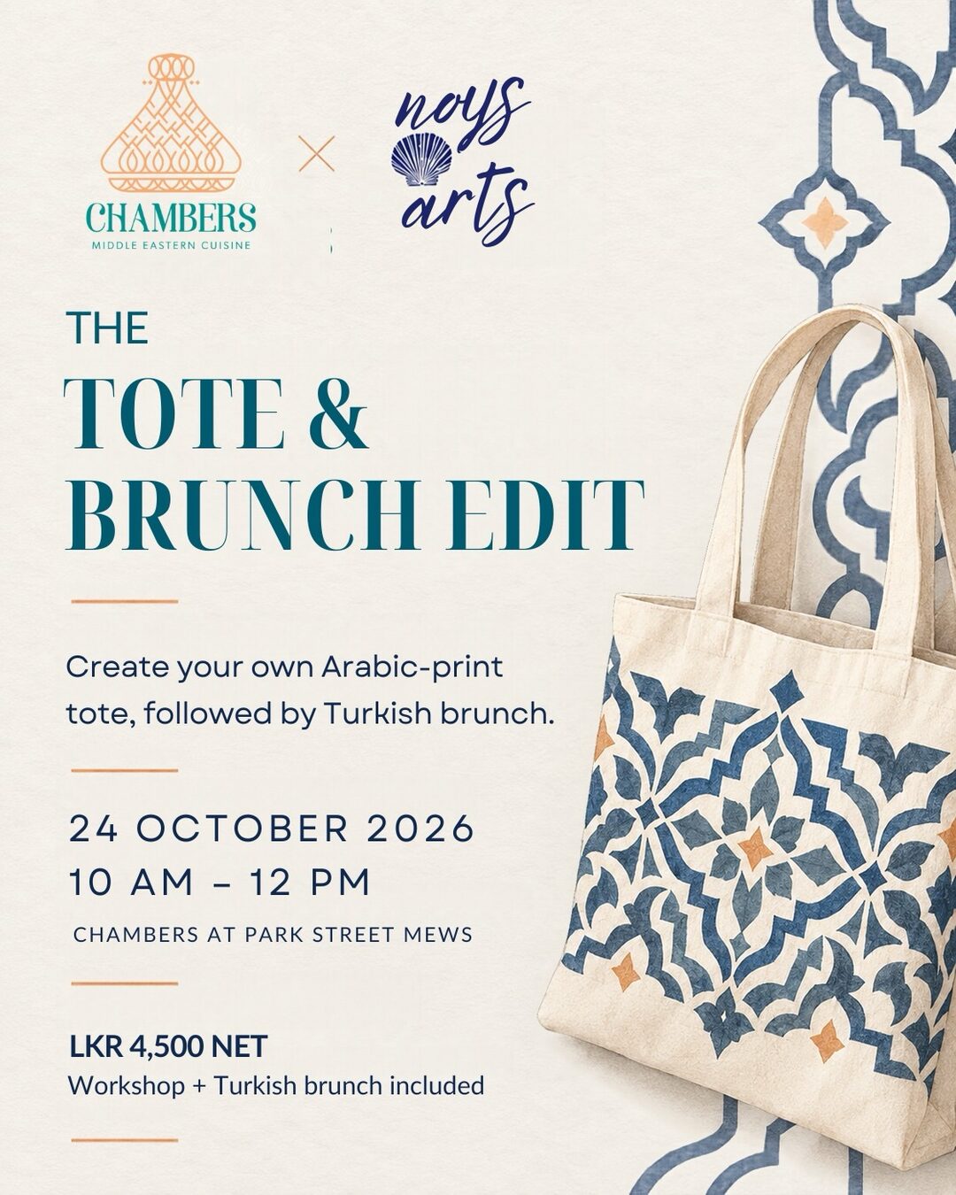
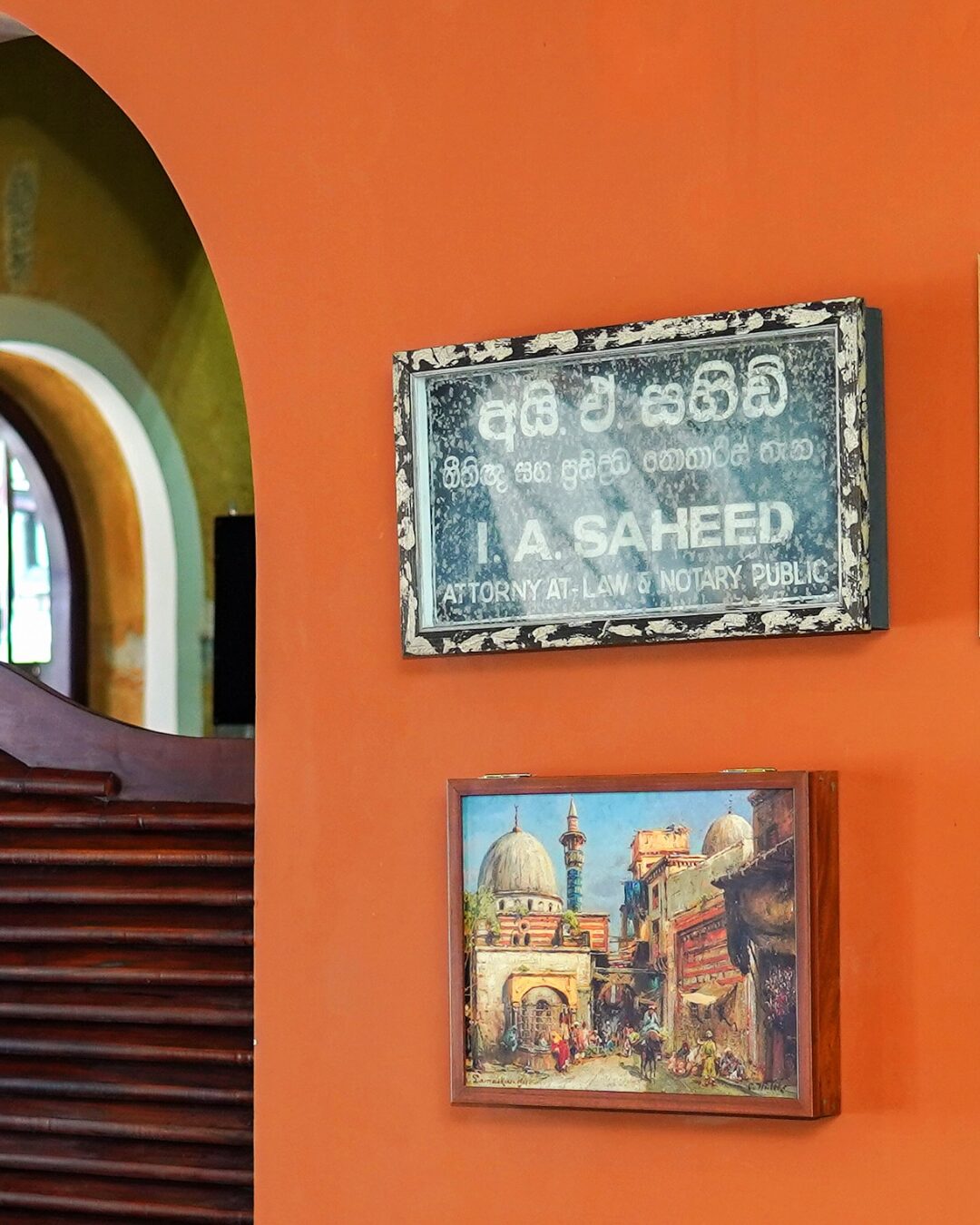
Photos from Chambers and @chambersrestaurants, 2025 to 2026, retouched for this page.
- Identity
- Hash Milhan
- For
- Chambers, Galle Fort and Colombo